# --- Setup ---
set.seed(2024)
n_sim <- 100

# Helper function to draw circles in base R
draw_circle <- function(x, y, r, col, lty = 1, lwd = 1) {
  theta <- seq(0, 2 * pi, length.out = 200)
  lines(x + r * cos(theta), y + r * sin(theta), col = col, lty = lty, lwd = lwd)
}

# Layout: 1 row, 2 columns
# mar: c(bottom, left, top, right) - decreasing margins to trim space
par(mfrow = c(1, 2), mar = c(3, 3, 3, 1))

# ---------------------------------------------------------
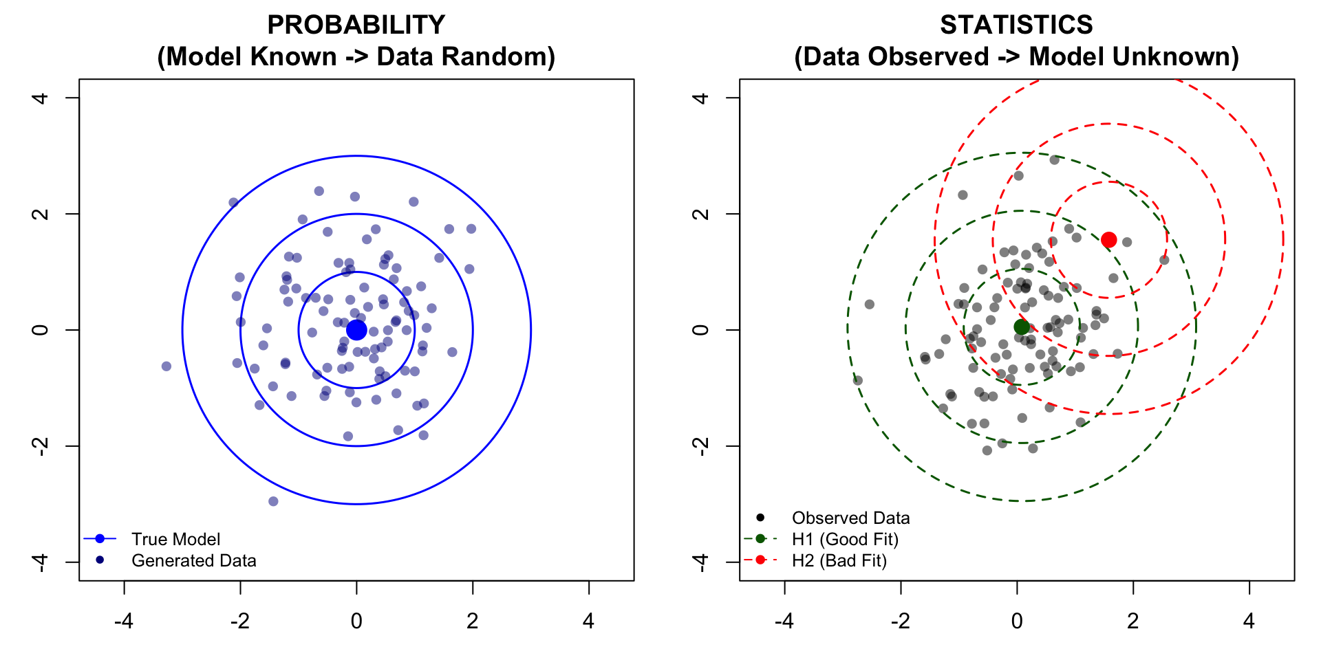
# PLOT 1: PROBABILITY (The Generator)
# ---------------------------------------------------------
# 1. Generate Data
x_prob <- rnorm(n_sim)
y_prob <- rnorm(n_sim)

# 2. Setup Canvas (asp=1 ensures circles look like circles)
plot(NA, xlim = c(-4, 4), ylim = c(-4, 4), asp = 1,
     xlab = "", ylab = "",
     main = "PROBABILITY\n(Model Known -> Data Random)")

# 3. Draw Model (True Center & Contours)
points(0, 0, pch = 19, col = "blue", cex = 2)
for(r in 1:3) draw_circle(0, 0, r, col = "blue", lwd = 1.5)

# 4. Draw Generated Data
points(x_prob, y_prob, pch = 16, col = adjustcolor("darkblue", alpha = 0.5))

# 5. Legend
legend("bottomleft", legend = c("True Model", "Generated Data"),
       col = c("blue", "darkblue"), pch = c(19, 16),
       lty = c(1, 0), bty = "n", cex = 0.8)

# ---------------------------------------------------------
# PLOT 2: STATISTICS (The Inference)
# ---------------------------------------------------------
# 1. Generate NEW Observed Data
x_stat <- rnorm(n_sim)
y_stat <- rnorm(n_sim)
x_bar <- mean(x_stat)
y_bar <- mean(y_stat)

# 2. Setup Canvas
plot(NA, xlim = c(-4, 4), ylim = c(-4, 4), asp = 1,
     xlab = "", ylab = "",
     main = "STATISTICS\n(Data Observed -> Model Unknown)")

# 3. Draw Observed Data
points(x_stat, y_stat, pch = 16, col = adjustcolor("black", alpha = 0.5))

# 4. Draw Hypothesis 1 (Good Fit - Centered at Sample Mean)
points(x_bar, y_bar, pch = 19, col = "darkgreen", cex = 1.5)
for(r in 1:3) draw_circle(x_bar, y_bar, r, col = "darkgreen", lty = 2, lwd = 1.5)

# 5. Draw Hypothesis 2 (Bad Fit - Shifted)
points(x_bar + 1.5, y_bar + 1.5, pch = 19, col = "red", cex = 1.5)
for(r in 1:3) draw_circle(x_bar + 1.5, y_bar + 1.5, r, col = "red", lty = 2, lwd = 1.5)

# 6. Legend
legend("bottomleft",
       legend = c("Observed Data", "H1 (Good Fit)", "H2 (Bad Fit)"),
       col = c("black", "darkgreen", "red"),
       pch = c(16, 19, 19), lty = c(0, 2, 2),
       bty = "n", cex = 0.8)